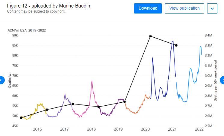
All-cause mortality is the most reliable data for analysing the “COVID-19 pandemic” —or any other so-called pandemic—because it doesn’t discriminate and it has no bias.
It is pretty much the gold standard.
Why?
Because it encapsulates the ultimate outcome: death.
Unlike other metrics that are subject to bias, misdiagnosis, or inconsistencies, death is definitive and recorded exactly the same everywhere.
A death is a death is a death.
It’s binary.
It cuts through the noise of definitions and diagnostic criteria. All-cause mortality data ignores how the person died. When time, age, and region are later used as additional variables, the correlations become (nearly) bulletproof.
Another important paper


Denis Rancourt’s team previously authored a huge paper in which they concluded that all-cause mortality data shows no viral outbreak in 2020.
There was no pandemic, in other words.
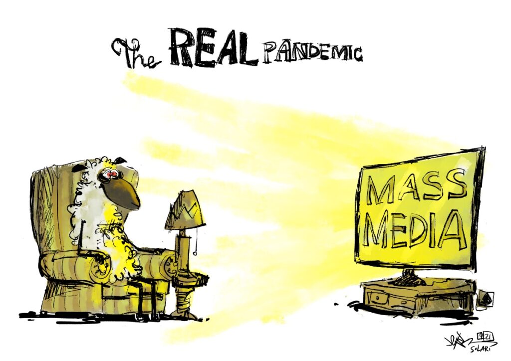
It was a campaign of fear and mass compliance.
Denis has since co-authored another big paper, COVID-Period Mass Vaccination Campaign and Public Health Disaster in the USA.
Summary
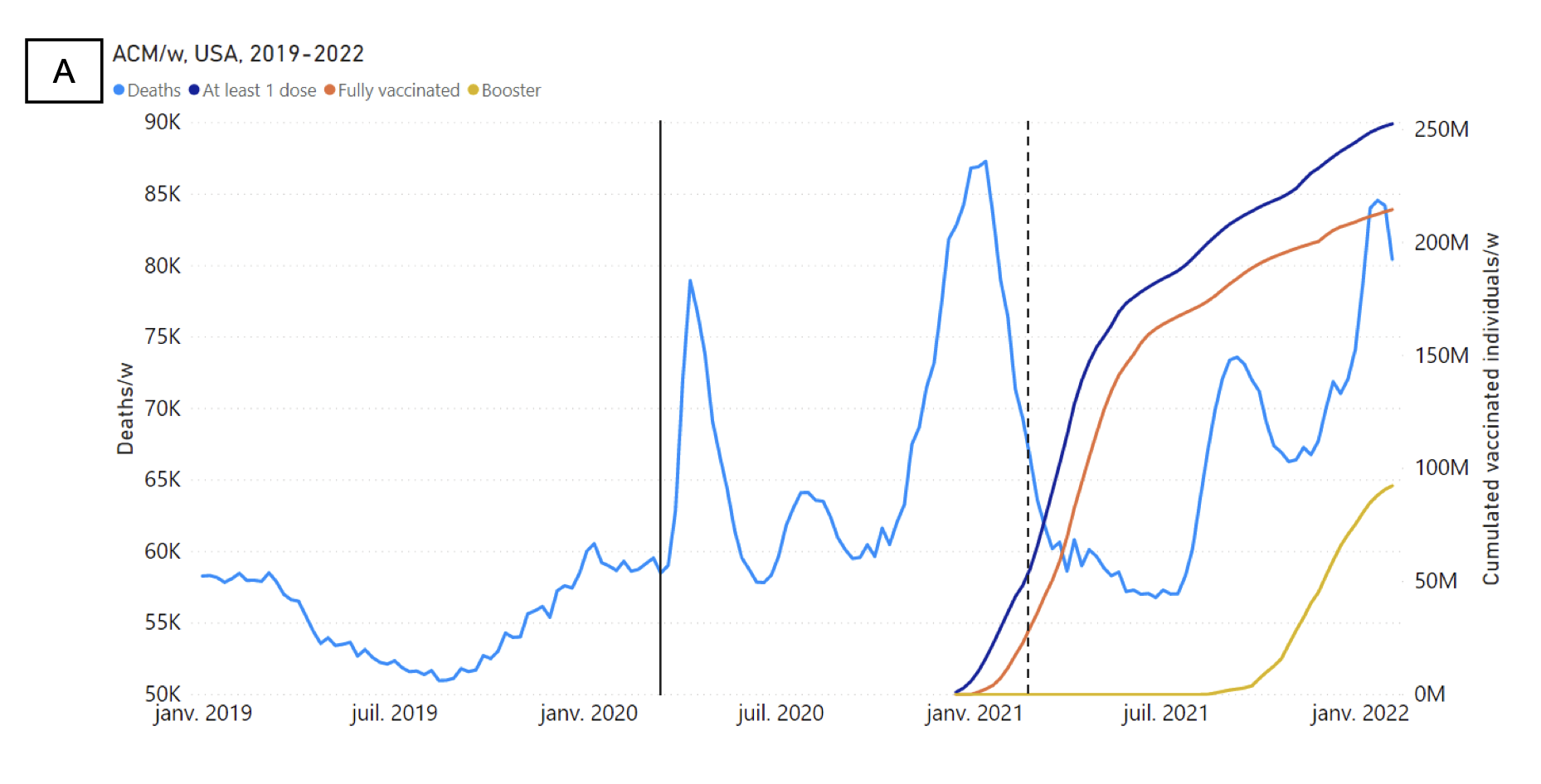
They analysed American all-cause mortality data during the ‘”pandemic” but, this time, they correlated it with the vaccine rollout.
It dissects data until early February 2022, contrasting deaths with vaccination stats by time, age, and geographical state.
The aim of the study was to spot any temporal links.

The results show that the jab didn’t cut all-cause mortality in the US.
Not even a little bit.
No deaths were prevented by the shot, while high excess mortality persisted throughout.
Deaths were due to poverty and other socio-economic factors (like lockdowns, stress, isolation and more).
For a detailed breakdown of the study, I recommend watching the presentation conducted by Denis and his co-authors Marine Baudin and Jérémie Mercier.


